Management consultants love analytical tools and www.FinViz.com is amazing. Take a look. It’s intuitive, fun, and gives you a macro-view of the US-based financial markets. I imagine this set-up would have cost $20,000+, twenty years ago, and now, it’s essentially free. No wonder its hard to “beat Wall Street.”
Tools give you leverage
A hammer, saw, or screwdriver are all useful because they give leverage. Same effort + tool = better results. This is why it’s so crazy frustrating to fix a drawer, or caulk a window without the right tools. On the flip-side, if these tools are widely available and free; you better know how to use them. Your clients do.
(US) Financial Markets + Visualization = FinViz.com
True to that name, this website really melts down the US equity markets into a simple, intuitive, and visually-striking financial market dashboard. There are a few screens that are worth your attention starting with the front page.
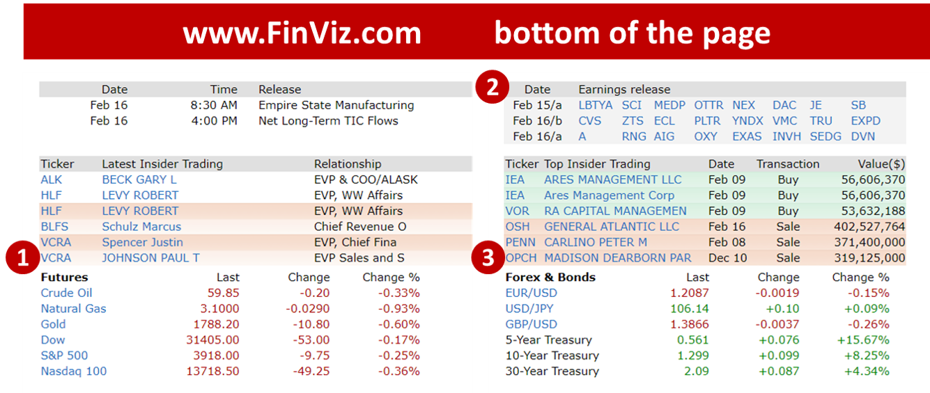
At the top of the page, you will see news and major indices. The bottom of the page is rich with content too:
1) Too often consultants – myself included – only think of equities. But the price of other commodities, asset classes matter including energy, metals, meats, grains, and currencies. If you click on the left you will see the trends on everything from silver, corn, and coffee.
2) Earnings – Which companies are scheduled to report today and tomorrow.
3) Interest rates on short and long-term US government treasuries. Interest rates continue to be dirt cheap. 10 yr =1.29%

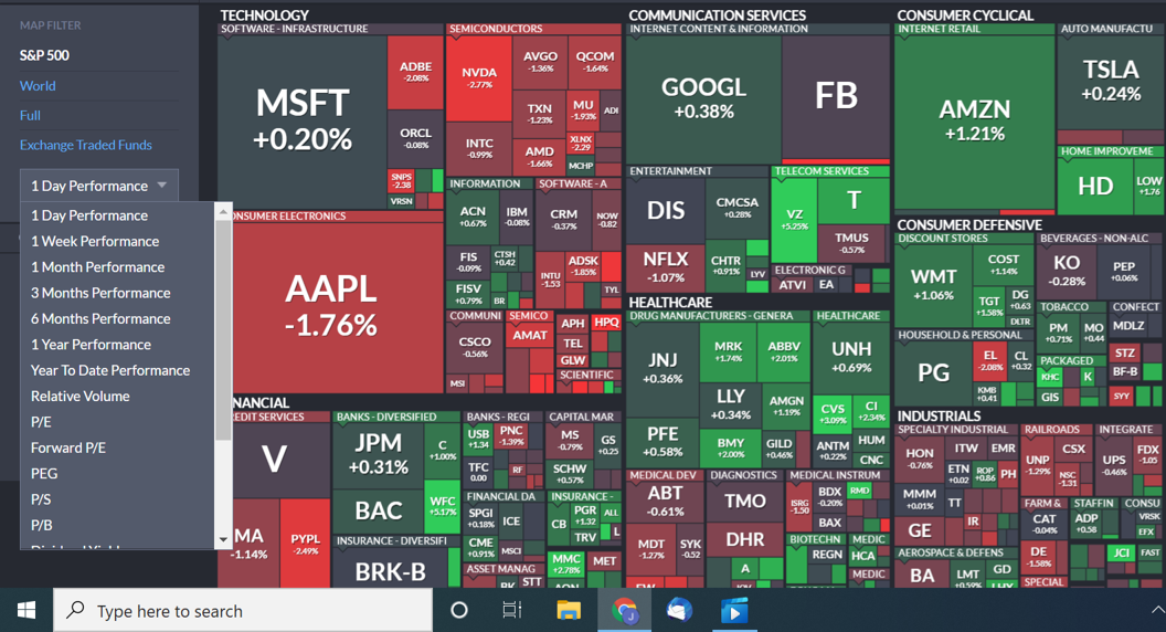
S&P 500 Heat Map
This displays all 500 stocks of the S&P index at once here. So rich in data. A master class is data visualization:
- (Grouping) Companies are grouped by sector and industry (top left is Technology)
- (Size) The size of the box represents market capitalization; Larger companies = bigger boxes
- (Color) Green = good, red = bad
- (Click) One click zooms in, two clicks goes to the specific stock
- (Drop down) On the left, you select stock performance (1 day, 1 week, 6 month, 1 year), dividends, and P/E

This 1 day (12/17/2021) looks like it was so-so. A mix of green (up) and red (down). In the middle, you will see the brightest greens are VZ (Verizon up 5%) and CVS (3%) which rose as news of that Warren Buffett (Berkshire Hathaway) had increased their position in the two companies. Apple (AAPL), Nvidia (NVDA) and Paypal (PYPL) were the big drops.
Finviz Stock Screener
This tool helps you narrow down the list of 7,600+ publicly traded stocks using 60+ filter criteria here. While it is not an investment bank-grade Bloomberg terminal, you will be surprised how good it is. Look at all the filters you can use: market capitalization, P/E multiple, EPS growth past 5 years, dividend yield, ROE, current ratio, beta, RSI.
If you were curious how many profitable Chinese healthcare stocks are traded in the US, you could filter it like this. . .

It is a crazy useful tool, but be aware there are limits:
- Only shows publicly-traded companies in the US (Cargill, Koch, Chick-Fil-A not here)
- Categorizes company by their main business (e.g., Berkshire Hathaway is under insurance, not furniture, candy)
- The metrics are “pulled” from another site, so don’t forget to stress test them yourself
Follow your curiosity
In the end, this is a tool. A tool to ask great questions. A way for you to get smart quickly and know where to ‘dig’ for answers next. A few questions I had recently, that I used Finviz to answer:
- With Bitcoin going up, what has happened to the price of gold?
- How much have airline stocks improved since the low of the pandemic?
- What % of companies with a market capitalization of $10B+ are profitable?
- How many Chinese stocks are publicly traded in the US?
- What % of US stocks have a dividend?
What other Free resources do you like?

Do you mind if I quote a few of your articles as long as I provide
credit and sources back to your blog? My blog site is in the exact
same niche as yours and my visitors would really benefit from a
lot of the information you present here. Please let me know if this alright with you.
Many thanks!
Yes, that would be fine and thanks for reading.