Consultants always appreciate visuals. Here are some great bar charts from the Economist showing the differences between countries.Note: not all countries are shown. All great bar charts.
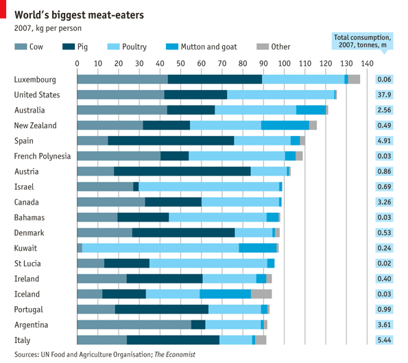
Meat Consumption by Country by Product
- Luxembourg, United States, and Australia eat the most meat per capita
- Argentina eats the most beef per person (think pampas)
- Kuwait eats the most poultry per capita, by a wide margin
- Austria eats the most pork per capita (curious how China would stack up)

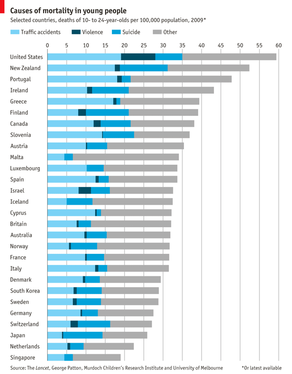
Cause of Mortality in Young People (10-24 year old)
- American young people have the highest mortality rate for this age group
- More Americans die from violence (dark blue bar) than other OECD countries
- New Zealand and Finland have the highest % of suicides from this age group
- The US, New Zealand, Portugal, and Greece have the highest traffic accident rates

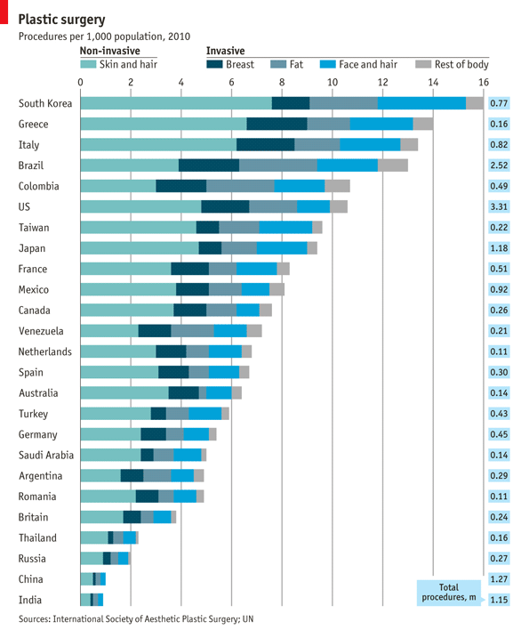
- South Korea has the largest number of plastic surgeries per capita
- Brazil has has the largest number of invasive plastic surgery per capita
- US and Brazil have the largest total number of surgeries (3.31M and 2.52M)

Related Posts:
