This is the final section review of Duarte’s Slideology (affiliate link). I am going to pick and choose what to share with readers. Consulting presentations (for good or bad) are fairly conservative and a bit regimented. As a result, the parts of the books about color, tone, font type, backgrounds, icons etc. . . is a bit superfluous. For the Big 3 and Big 4 consulting firms, their templates are set and follow corporate brand guidelines. If you Google pdf of major consulting firms you will see that they internally consistent; McKinsey looks like McKinsey, Deloitte looks like Deloitte. Duarte calls management consulting-type (read: business-y) presentations with lots of data.
1. Think like a designer
Over the last 3 years, I have enjoyed working with designers on a number of different projects and do appreciate their perspective. Intensely focused on the “experience” and engaging all your senses. (sight, sound, touch etc). When you are working with behavioral health patients, what environment do you want?
Design at its core is about solving problems. Essentially, designers focus on the experience, making it as beautiful and memorable as possible. To succeed as a presenter, you need to think like a designer. – Duarte
2. Arrangement matters
Like an interior designer or decorator who creates a unique living space in your house – what goes in the room, where it is located, the point of focus, flow, and relative size all matters. Junking up the slide with tons of text or graphics is not effective communication. It is lazy. Duarte rightly says that it is the presenter’s responsibility to keep the audience engaged and “making ideas easy to decode.”
This is the same reason that consulting presentations often follow the Pyramid principle and have “answer first.” We don’t want out expensive (often impatient) executive client waiting to hear what the main points are.
3. Use contrast
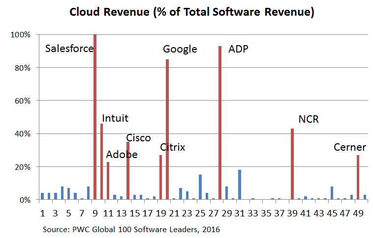
This will seem obvious to PowerPoint pros, but use color sparingly and effectively. In my first job, my then-CEO gave me constructive criticism on a graph saying, “If you want to point out X, why are there 5 different colors? What do the colors mean? Just highlight everything else gray, and highlight the focus red.” From a previous post on the top 100 Software vendors, I highlighted the key players in red – just like my old boss suggested. (Hat tip: YIL)
4. Use whitespace
Duarte calls this “breathing room” and it is something consultants are uniquely bad at. Look at this one slide of Deloitte that I dug up off the internet. Holy &$#! that is busy and confusing. They would have been better off showing a fraction of the information and letting it speak for itself. This is a perfect example of what NOT TO DO.
It’s okay to have clear space- clutter is a failure of design. – Duarte

5. Three second reading rule?
This book is exclusively focused on “stand-and-present-to-large audience” format presentations. However, most consulting PowerPoint are to more intimate groups or even print-outs discussed over a conference room table. Duarte tells readers to reflect on whether their PPT message can be deciphered in 3 seconds. She argues that it should be as easy to comprehend as a billboard on the highway. I disagree.
For 80% of the slides I have made over the last 15 years, the answer is “no” and I am unrepentant on that. She may have a point for large-audience (e.g., 300+ people) or product launch / marketing events, but for strategy / operations presentations – it is WAY unlikely that the CxO will look at the slide for 3 seconds and say, “yes, you are right, we should consolidate all the AR/AP function.” No way.
6. Avoid 2 line titles?
I have mixed emotions about this. While I understand the argument of not over-complicating the title area – a lot of consultants (including me) use the title bar to tell a specific narrative and storyline. We don’t like to leave it to chance. See this example from Bain here. This is pretty typical for consultants.
7. Validate your font size
Great advice. If your font size is too small, you are dead. You will look foolish. Remember that people are seeing it for the first time. Not everyone has good eyesight. Go to the venue for a dry-run. Or as Guy Kawasaki famously said, “A good rule of thumb for font size is to divide the oldest investor’s age by two, and use that font size.”
8. Limit animation
Duarte did not say it quite that forcefully, but I will. Animation (text fade/reveal/disappear/move) has a place for lectures and one-way broadcasting of dense content to students. However, for most people and context it comes across as gimmick-y and over-done.
It’s tempting to make everything buzz like a fly or swoosh like a rocket. Don’t do it. . . Every change, no matter how subtle, creates a distraction. – Duarte
9. Reduce text on the slide
Great advice. There is something I call “PowerPoint English” which uses as few words as possible to get the point across on the slide. Personally, I prefer for the bullets (lines) to not carry over to the next line unnecessarily. Like this example from BCG that I found in the internet. The phrases are terse and meaningful. “Measured as outcomes, not inputs” “Defined around patient, not supplier” That is PowerPoint English – your high school composition teacher would not like it, but it says a lot in a small amount of space. You get the point.

10. Think like a movie director
As a presenter you are telling a story with context, content, continuity, and drama. As Duarte says, “Great presenters connect with their audience, speak naturally, and allow the slides to enhance the story.” Don’t forget to storyboard from start to finish.
11. Create drama
Don’t forget to pause – they are powerful. Also, use “B” and “W” while in presentation mode to turn the page [B]lack and [W]hite – and have the audience focus their attention on you. Use the stage, use body posture, inflection in your voice. Make it interactive as appropriate. Use props. Use videos. Use flip charts. Turn the projector off. Do what works.
12. The Golden Rule
Duarte ends her book with the right tone and message.
Never deliver a presentation you wouldn’t want to sit through. – Duarte
Related posts:
- Presentation Tips from TED’s Chris Anderson
- Misleading Graph #1: Starbucks Investor Presentation
- Links
I really enjoyed your posts on improving ppt skills. However, Duarte seems to have very poor reviews on Amazon – is it worth buying?
PS – keep up the great posts 🙂
Hello Sarah, thanks for reading. If you use powerpoint daily in your work – probably worth owning – if only because so many people reference it, and apply it. As a management consultant – I believe her online (free) presentation on slidedocs is more useful – http://www.duarte.com/slidedocs/
In short, review this free link first – then see what you think, and if you like to own books (like I do, a bit of a bibliophile), then you can buy it. You can also get it used.