Consultants are in the business of taking ambiguous problems, structuring them, and telling cogent, actionable stories. This often involves charts – yes – charts and graphs. The older crew – like me – is used to Excel, but you will also see Tableau, Cliq, and other Prezi-like craziness. First and foremost, the content needs to be relevant and accurate. Then, it needs to be easy to understand and insightful. So what happens when you see bad graphs?
See a collection of bad charts below from investor relations presentations from Fortune 500 companies. Yes, the best of the best also make bad charts:
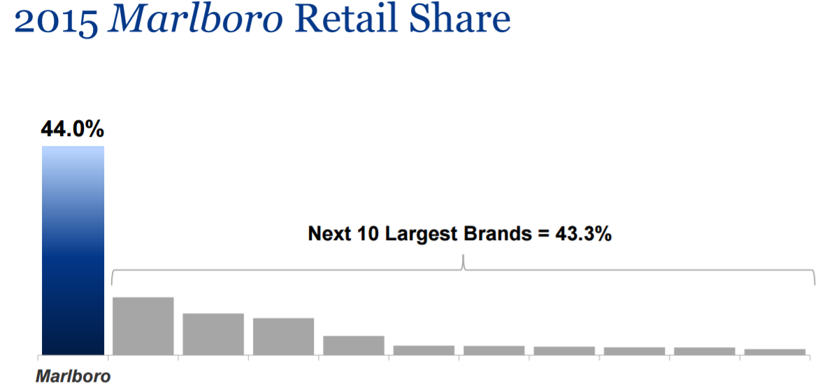
Bad Chart #1: Altria (2.9Mb), no axis labels here
This is something you see all the time. No Y-axis labels. You can only guess what the bar charts are supposed to say. When making charts – don’t do this.
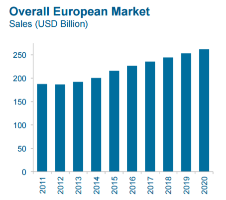
Bad chart #2: General Electric (8.8Mb), incorrect x axis here. Similar problem, but this time on the x-axis. General Electric is showing European sales for years 2011-2020. Small problem. It is only 2017 – which means that 2018-2020 is a forecast. It should read 2016A, 2017F, 2018F, 2019F, 2020F. Don’t mislead people into thinking that you actually KNOW for a fact what 2018-2020 will be. Not true.
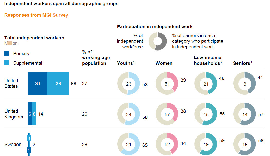
Bad Chart #3: McKinsey (1Mb), overly complex table here. Yes, even mighty McKinsey makes bad tables and charts. Look at this one below. Each row, representing a country, has 12 numbers. This should be an appendix and each of each data element could be it’s own table. Don’t do what McKinsey did here and try to put all your data on one table. It’s not clever or cute. It’s rabidly busy, and a little confusing. “Blinding them with science.”
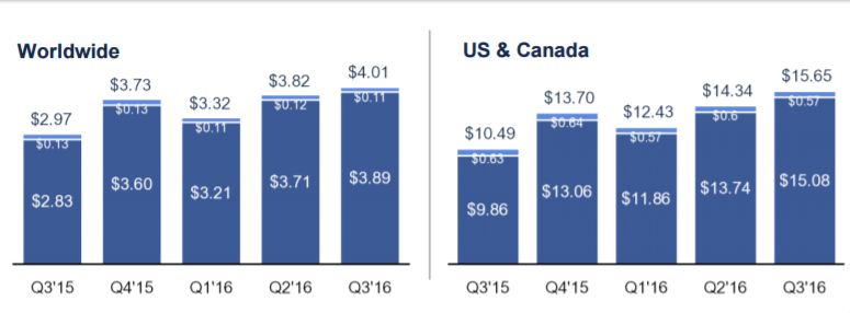
Bad chart #4: Facebook (2.8Mb), misleading comparisons here. You need to be careful when you put charts next to each other that have different scale. Look below and it looks like World Wide and US / Canada revenue per user is similar. The bar charts are similar height, right? Wrong. Worldwide $2.97 is taller than US/Canada $10.49. Not good. Starbucks is also guilty of this investor relations faux pas here.
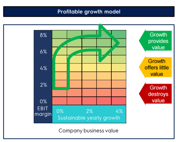
Bad chart #5: Electrolux (3.6Mb), strange “strategic” diagram here. I believe the intention of this diagram is to show that Electrolux will increase profits first, then growth. Simple enough – however – this color-coded, highway sign does not do the trick. IR folks – sometimes, just a simple bullet point can be better than a graph we cannot understand.
Note: if it takes the view more than 5-6 seconds to understand the diagram, it is not working.
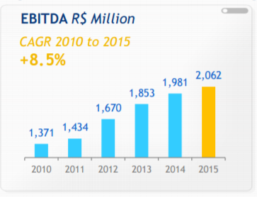
Bad chart #6: Ambev (3.8Mb), no y-axis label here. Similar to the Altria chart #1, this investor relations chart there is no axis label on the left. As a result, the 2015 results of 2,062 actually look 4x larger than 2010 results of 1,372. It is graphical trickery, and not good.
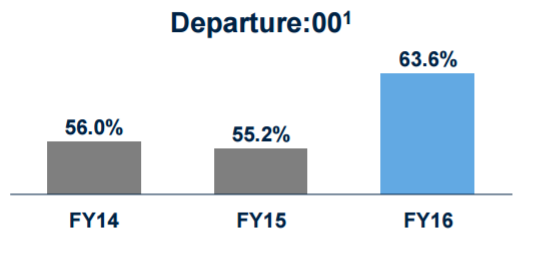
Bad chart #7: United Airlines (1.4Mb), no labels here. Same as above. Without labels, 63% looks like it is 3x higher than 56%. I am not great at math, but that is not true.
Bad chart #8: P&G (7.2Mb), no labels here. I have mad respect for P&G (they have given out dividends since 1890), but this slide-craft is pretty sloppy. On page 37 of their investor relations presentation, they actually have this chart which has ZERO labels. No matter how smart you are, you will be unable to decipher what this means. Flat is good? I guess?
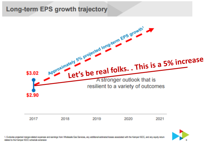
Bad chart #9. Southern Company (0.5Mb), Unsubstantiated forecast here. This graph is actually a little scary. It shows a 4 year forecast for earnings at roughly a 45 degree angle calling it a 5% long-term EPS growth percentage. I did the same graph on excel and overlaid (is that correct English?) the line in burgundy color. Let’s be real folks. . .
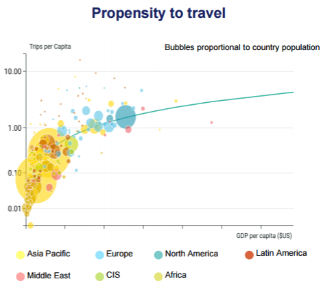
Bad chart #10: Airbus (0.8Mb) Bubble chart with little meaning here. All consultants, marketers, strategic planners are guilty of this – creating charts with available data – which sadly, don’t say a lot. This is a chart where it graphs three things:
- GDP per capita
- Number of trips per capita
- Country population
The takeaway is that 1) there are lots of Asians who travel a lot less 2) Americans and Europeans who are wealthier and travel more. . . . uh, not a needed slide.
Related posts:
How do you get access for this presentations?
Tks
You can click on the link that says “here” and is underlined. They are mostly from investor relations websites – which are free.
Yes, these investor relations websites that I was thinking, 🙂
There’s one that would you recomend?
Tks
Recommend for what purpose? If you want to learn good PowerPoint and presentation skills – investor relations are not the best choice. Look at some management consulting ones – McKinsey, Bain, BCG, Deloitte etc.
Thanks, interesting post. Some charts are very obviously horrible. The lesson for me is, it is as important useful to have charts proofread, if possible, by someone other than the author, as it is for text.
No #7, is an example of an x-axis scale that does not start at zero. It sometimes has a place, if the variation only happens in a small area. Consider safety statistics. Let’s say a bad month in a sequence would be 96% injury free, and we strive for 100%. The other values are in between, I would not force zero to be shown on the scale as it wastes space, and impacts on readability. All the bars would appear the same height unless you use a magnifying glass.
In the safety stats case I would then have the scale start at 95%. If you are pedantic then you label the axis on the left. But if there is 5 or 6 values, and variation, I would opt for not including the axis, but label the values clearly. Sometimes a straight line (industry norm, or target, with a labelled value) serves to strengthen the implicit understanding of the scale. No viewer would be disturbed that 98%, visually, is three times higher than 96%. It is too exaggerated to confuse. In that context, if converted to a score, 98% may well get 3 out of 5, with 96% getting 1 out of 5. So the bars matches the value attachment of the viewer.
I do agree with your critique in this specific case, I would also not use a zero scale in the case of the example you posted, as the risk of the viewer implicitly expecting a zero scale, as you demonstrated, is significant. The difference between that and a zero scale is not exaggerated enough to be obvious.
Thank you for the push back – get your point completely. Think we are coming at this with the same perspective – graphs are powerful and should be used thoughtfully.
Let me know if you run across even worse examples of chart malpractice, and I will add it to the post. Thanks,
Chart #10: I see that the propensity to travel increases exponentially when GDP/Capita is low. In other words, if I expect GDP/Capita to grow in Asia-Pacific, that’s where I will get the best return on my investment.
Great post though, #9 is genius hahaha!
Thanks for the comment. Yes, agree on the point that GDP per capita is correlated to travel. Makes sense. Actually makes so much sense, that the graph actually distracts the viewer from that (somewhat obvious point). Agree. #9 is just too much. People should draw graphs based on data. Thanks for reading.