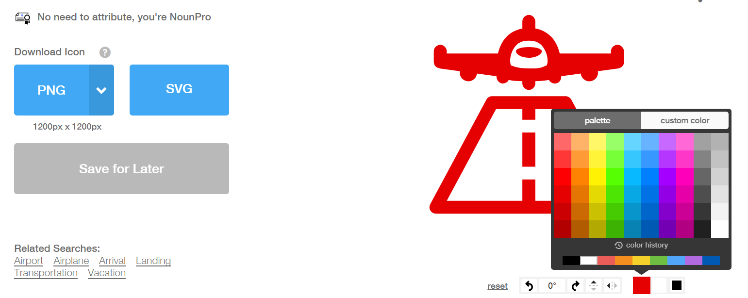
The NounProject is a website where you can search, download, and customize millions of icons. Consultants are continuously “bucketing” ideas and concepts, and icons are a classy way to draw the viewers attention to a bucket. This is different from clip art (bad) which is just trying to fill up space. Just learned about this last week, but a huge fan. (Hat tip Chicago friends)
Why not just use Google Images?
Yes, you can certainly find random icons online. That’s what I have been doing for 25+ years. Here are some benefits to a more organized (read: less random) approach:
- No watermarks
- No need to attribute creator; when you pay for the premium version
- Can rotate, change background, change color (to match your company or client)
- Can use collections (same artist, same theme, same look)

Too easy = icon inflation
Is there a real danger that an entire generation of consultants will get icon-happy and start putting icons on every page. Assuredly. This will inevitably create some minder frustrated at grinder scenarios, so we need to use these sparingly. Once you add the PowerPoint / MS Word add-in, it just becomes too easy to slap icons on everything.
![]()
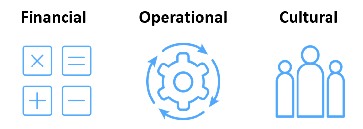
Use icons to create buckets
Rather than randomly putting in icons to “spice up” your presentation (does not work), why not think more rigorously about the different buckets of analyses and recommendations. Why not use visual cues to make it easy for the reader to follow along? Consultants excel at breaking down problems. Here’s a example below:

Start training your eye
Most of my work is dry – but what if you are a marketing consultant who wants to show different demographic, psychographic segments? Wouldn’t it be nice to have a standardized, easy-to-see, similar icons? It’s useful to see how real artists are using symbols, archetypes, themes, visualizations every day.
Advice to creators, also applies to consultants
This is a two-sided market where people can create icons, then get paid when people use them. Yes, this site gets more valuable the more than people use it. So it’s interesting to me to see what advice they have for their suppliers (artists) here. Their principles of design:
- Speak visually, no numbers or letters
- Consistent style
- Properly connected, properly aligned, consistent spacing
- Clean shapes, don’t overlay unnecessary shapes
What is an iconathon?
Fascinating idea that public policy makers (and anyone looking to change behavior at scale) can benefit from clear icons, signs, and symbols which short-cut communication. For example, what does “compost” look like, that differentiates it from garbage, which encourages people to put their food leftovers in the right place? Fast Company article on how the NounProject is involved here.
Gotta get back to work – big fan of this tool. Remember, we are expensive people, if this saves you 20 minutes, it’s worth it. Happy hunting (for icons).
Related posts:
